Tag: iPad

WordPress iOS App Now Has WYSIWIG Visual Editor

Writing blog posts for a WordPress site on an iPad or iPhone just got a whole lot easier! Or... at least, a whole lot prettier! With the new version 4.8 out this week, Automattic included a new visual editor that can give the "what you see is what you get (WYSIWIG)" experience:

Wordpress 4 8 wysiwig

Here is what it looked like before the change on my iPad - basically, it was just a raw HTML editor:

WordPress ios app before upgrade

There was a preview mode that would let you see what it was going to look like, but all the writing was in HTML. No big deal if you are a long-time HTML coder like me... but probably not the most fun for newer writers - and the HTML markup is also distracting.

Here is what the new post-upgrade view is:

WP iOS app after upgrade

A much nicer view - and also some of the commonly-used features are more accessible. There's also the "HTML" button for those who want to get into the actual HTML code.

The WordPress.com blog post about the new iOS version gets into a few of the other features that the new app has. I do like the updates to the navigation. I haven't yet worked with the new image settings, but look forward to doing so.

Anyway, if you haven't yet upgraded the WordPress app on your iOS device, you may want to do so... and if you haven't tried the app in a while you may want to give it a new try.


If you found this post interesting or useful, please consider either:


How To Turn Off Sounds In The Facebook iPhone / iPad App

Do you want to turn off / disable the sounds that Facebook just added to the latest version of their iOS app for iPhone and iPad? If you are like me and find these kind of sounds associated with actions (such as "keyboard clicks") annoying, here's what you need to do.

1. Go Into The Settings Inside The App - First you need to tap on "More" in the lower right corner of the app and then tap on "Settings":

Facebook ios settings

2. Go Into "Sounds" - Next tap on "Sounds":

Facebook ios sounds setting

3. Turn Off "In-App Sound" - Finally, just tap the slider to turn off the sounds.

Facebook in app sound

Now, maybe you like these kind of sounds... but I personally don't. I'm the guy who turns off "keyboard clicks" because I do NOT want to hear a sound whenever I tap a key.

I don't want aural feedback.

Some of you may... and that's fine. I don't.

Someone at Facebook seemed to think that we all wanted this and so they added it in to one of the recent releases and... ta da... as soon as we updated the Facebook app on our iPhone or iPad we started getting clicks and swishes and other sounds.

This points to one of the larger issues with our new world of mobile "apps":

We are at the mercy of whatever the app developer wants to do.

If this were a browser-based "app" (a set of web pages), we could typically configure the browser to not play any sounds - and then all web pages would be subject to the settings in the web browser.

But we've left that land where the web browser serves as our window to content. Instead we have custom-designed apps where we have to figure out where the settings are in each of the different apps.

For instance, when the sounds first started in the Facebook app, I went into the generic "Settings" app in iOS to try to find out how to turn them off. I looked under:

  • Facebook
  • Sounds
  • Notifications

and couldn't any settings in any of those places to turn it off. Only then did I tap on the "More" inside the Facebook app to see if there were any settings there.

Now... the good news is that at least Facebook gave us a control to turn the sounds off! They didn't have to and could have just made that a mandated part of the app.

But that's back to the point... for the convenience and simplicity of using a mobile app, we've surrendered control to the whims of the application developers.

I'm personally not really thrilled about that evolution of the mobile Internet, but it's hard to see how we walk back to a different path...


An audio commentary on this topic is also available:


If you found this post interesting or useful, please consider either:


The Problem Of Trying Blogging From An iPad Using TypePad

Yesterday's blog post epitomizes one of the problems I have with creating blog posts on a tablet that work with TypePad, the service with which I started hosting this site way back in 2005.

All I wanted to do is have an image that was right-justified with the text wrapping around it. Instead I got this:

Rightjustified not

(Which has now been changed to be correctly right-justified, but through the regular desktop web interface, not to the mobile interface.)

In order to write more regularly, I've been trying out using the iPad as a writing platform. It's been working well for sites hosted on WordPress, but not so well for TypePad.

Because the TypePad app is fairly useless on the iPad, I wrote the post using Blogsy, a fairly interesting and useful blogging app for the iPad. However, try as I might, I could not get Blogsy to right-justify and wrap the image. The issue seems to be that Blogsy would only send to TypePad the <img> tag with this attribute:

class="alignright"

Now this might be fine if the CSS for my theme on TypePad defined a class like that, but it doesn't. I tried multiple times to edit the raw HTML in Blogsy to add the simple inline CSS to the IMG tag of:

style="float:right;"

However, Blogsy kept removing that style attribute when sending it to TypePad. Now, maybe there is some setting in Blogsy that I couldn't find that would pass along CSS attributes... but if so, I have no idea what it is.

Trying other apps to correct the problem... as I mentioned, the TypePad app is fairly useless on the iPad. It is only an iPhone application and so while you can blow it up to take over the whole iPad screen, it is still an iPhone app and doesn't make use of the iPad's screen nor of its improved keyboard. More importantly, it only lets you create new posts - there is no way to edit or modify existing posts... so there was no way to get in and modify the post to add this style attribute to the image.

Next, I tried the "mobile" website for TypePad, but it doesn't seem to work so well on the iPad. I tried to get in and modify the post above and wasn't able to easily do so.

Finally I tried logging directly into the "regular" TypePad website on the iPad. It looked like it might work as I could get into the HTML view (which was the only view, actually) and add the style attribute. But when I went to try to publish the updated post, the Publish button didn't work.

In the end, I had to go to my desktop system and login to the regular TypePad web interface to make this change.

This is a perfect example of what I referred to in my "Barriers to Blogging" series as "Getting The Tools Out Of The Way". A whole chunk time spent... simply to get an image to be right-justified. :-(

Now to get the tools out of the way in this case, I may again search for a better blog post editor on the iPad. Another option, of course, would be to move this blog off of TypePad and over to one of my WordPress servers (where the tools work better)... but that's a much longer process. Still, it is another answer.


If you found this post interesting or useful, please consider either:


Google Now Lets You Handwrite Search Queries On iPad, iPhone, Android

Google handwritingOkay, I admittedly find this pretty cool... you can now enter search queries into Google on a tablet or mobile phone just by writing anywhere on the screen!

As Google's blog post outlines, you need to go to www.google.com on your mobile device and then go into the Settings to configure this option. You do NOT need to sign in to Google. You just need to go there in your mobile web browser.

I've tested this on both my iPad and iPhone and found it worked quite well (per the blog post and Help Center page, it also works on Android phones and tablets - and is available in 27 languages). I find it particularly useful on the iPad where you have the larger screen to write on. On the iPhone, maybe my fingers are just too big but I found it tight to write in the regular portrait mode.

I did notice, though, that you can enter one or two letters, pause, then enter another letter or two... and as you do the search window is updated with what Google thinks the text should be as well as search query suggestions. So you may just be able to write a few letters and then tap the correct search suggestion.

Now, the question, of course, is WHY I find this interesting and the answer is that I have had some times when I'm in situations where it's not super easy to type nor do I want to be talking to my phone (i.e. using Siri). With the iPad, in particular, there are times I'm holding it while walking around at an event where typing with two hands would not be easy and voice usage isn't really possible. I could see this potentially being faster than hunt-and-peck typing a query using one hand. Will I use it all the time? No... but certainly I can see it being nice to have this option.

What's also interesting about this feature is that it requires you to go to "www.google.com". It doesn't work with the "search" box that is in the top of Mobile Safari in iOS. You need to go to Google's home page... so Google is pulling you out of using the app (Safari) and into using their web page. If you get used to doing that, Google can of course introduce other functionality - and if you are "signed in" you see your Google+ notifications and can easily access other Google services. Intriguing move by Google.

What do you think? Will you use this capability on your iPad, iPhone or Android device?

P.S. Alas, it is not as all-powerful as TechCrunch asserts with an ability to interpret cursive handwriting. I made several attempts at using cursive and found that in some cases the accuracy was "okay", but clearly not as good as block printing. In fact, Google's Tips for Handwrite very clearly state at the beginning that you should use block printing versus cursive.

And here is Google's video on the topic:


If you found this post interesting or useful, please consider either:

Storify Rolls Out New iPad App That Makes It Super Easy To Curate Twitter, Facebook

StorifylogoWhile I've not yet personally used Storify to a great degree, I've been watching what friends have been doing with it and been intrigued by the possibilities. Beyond the "collecting a twitter stream into a story" usage that people commonly discuss - and that is incredibly useful, I've been watching what, for instance, Shel Holtz has been doing to curate websites into ongoing collections. For example, his "Every company is a media company" or his "collection of social media policies".

I may, though, start using Storify a bit more now that they've rolled out an iPad application. Given that the Storify app is free in the iOS App Store, I downloaded it and started playing with it this morning. It's a wonderful example of how the touch interface of a tablet can be such a joy to work with. It's so very simple and natural to drag and drop tweets, photos, etc. to create new stories. Definitely something I'm going to look at using more when I have stories or topics I want to curate into a larger "story" for publishing out to the web.

If you have an iPad, you can download the Storify app and try it out yourself... and if you don't, you can watch the video that shows how it works:

Very cool to see how application designers are continuing to evolve our user interfaces... looking forward to seeing how this all continues...

O’Reilly Offers Free Ebook: "Publishing with iBooks Author"

PublishingwithiBooksAuthorIn an interesting move, O'Reilly Media has made their brand new ebook, "Publishing with iBooks Author", available for free download (assuming you have a free account set up with O'Reilly). As is standard with O'Reilly now, the ebook is DRM-free and available as EPUB, Mobi (Kindle) or PDF.

Now, I personally have serious issues with iBooks Author with regard to its deviation from the EPUB standard and the legal lock-in that restricts sales to Apple's iBookstore. It also annoys me that books created with the tool will only work on the iPad, even while I understand Apple's strategy.

Having said all that, I've played with iBooks Author and it is a great tool for creating ebooks. Apple has raised the bar on ease-of-use for ebook creation tools and that is definitely a good thing. As my attendance at O'Reilly's Tools of Change conference last week in New York certainly showed to me, we need tools that are easier-to-use for even more people to be able to create ebooks.

My sincere hope is that creators of other ebook authoring tools will take a serious look at what Apple has done with iBooks Author and figure out how to deliver a similar (or better) user experience where the final output can also work on other ebook platforms. The tool vendor who can do that will certainly receive a lot of interest judging from the conversations I've had with people both at TOCCON last week and also in numerous other venues.

So to that end, I commend O'Reilly on releasing this new ebook for free and I do hope people will download it and understand just what Apple has done to make ebook creation so easy... and then use that knowledge to build even better tools!

P.S. In full disclosure, O'Reilly is the publisher of my most recent ebook, but that has nothing to do with why I am writing about them here. (And it was written entirely in DocBook XML, because that's just the kind of author I am... )


If you found this post interesting or useful, please consider either:


Facebook’s iPad App Now Available With Gestures, Cool Places Display and More

Today, the long-awaited and long-delayed official "Facebook for iPad" application became available in the Apple AppStore. Having been an early iPad user and an avid Facebook user, this is one app I've been wanting for a long time.

NOTE: I already had the iPhone app installed on my iPad and after "upgrading", the app repeatedly crashed and wouldn't open. Following advice online, I deleted the Facebook app from my iPad and then installed it again from the AppStore. It then worked perfectly fine. It would seem Facebook missed something in the upgrade process.

Once launched, the Facebook app gives you a nice view of your NewsFeed and your list of friends available online for a chat:

Facebookforipad1

Touching the "menu" button in the upper left corner - or simply swiping your hand to the right - displays a left-side navigation menu with easy access to different parts of Facebook:

Facebookforipad2

I found the app very easy to use and very "iPad-like" in that it used many of the common gestures and motions of many other iPad apps. (Such as, for instance, pulling down the NewsFeed to refresh it.)

One piece that was particularly cool was the visual representation of what used to be called "Places". If you click on "Nearby" in the left menu you got a map showing you your location and who has checked-in nearby. You can of course pinch and expand to zoom in and out of the map. In this image below I zoomed out to see all of the US and I could see who has checked in around the country:

Facebookforipad3

Of course, this only works if people actually do check-in and, as you can see from this map, only a small number of my friends in the US actually do use this feature of Facebook. Still, it's very cool to see how it looks in the iPad app.

I've only started using the app today, but so far I've been quite impressed. Very nice use of the iPad display space, user interface, gestures and more.

If you have an iPad and are a Facebook user, you can get the app through the AppStore (note my comment at the beginning about "upgrading"). If you have already tried it out, what do you think?


If you found this post interesting or useful, please consider either:


Textastic – a great iPad code editor

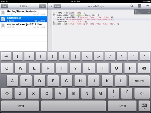
Lately I have been looking for a code editor for the iPad … and am VERY impressed so far by Textastic. It is not a free app, but it has been well worth the money already. with it, i was able to very easily create the rough draft of an HTML email newsletter on my flight down to Florida… i have also done some codinv in it…

The are a range of great featurea, but the most prominent one is the simple extra row on top of the keyboard that gives you characters commonly used in programming. HUGE timesaver! as shown in the image below, you can work with multiple files… all in all I am extremely impressed. Many thanks to the friends on Twitter who suggested it!